 复制
复制 导出
导出 注解
注解 打印预览
打印预览 源代码
源代码 子项
子项 附件 (1)
 历史记录
历史记录 信息
信息
第一次开发前端项目,也是第一次使用 React 开发,虽说都是 flex 布局,但依然调样式调到想吐。
没办法,根据以往开发 APP 的经验,参考 Android 和 HarmonyOS 的线性布局概念,用 React 实现了一个线性布局组件 LinearLayout ,配合占位组件 Placeholder ,可以在不写任行一行样式代码的情况下编排出想要的布局。
使用示例
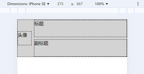
以编排卡片布局为例,左边一个居中的头像,右边上下为主标题与副标题,中间带有分隔空间。
代码如下:
<Placeholder height="128px" color="lightgray">
<Row>
<Compact align="center"><Placeholder alt="头像" width="48px" height="48px" /></Compact>
<Blank/>
<Stretch>
<Column>
<Stretch><Placeholder alt="标题" /></Stretch>
<Blank/>
<Stretch><Placeholder alt="副标题" /></Stretch>
</Column>
</Stretch>
</Row>
</Placeholder>
<Row>
<Compact align="center"><Placeholder alt="头像" width="48px" height="48px" /></Compact>
<Blank/>
<Stretch>
<Column>
<Stretch><Placeholder alt="标题" /></Stretch>
<Blank/>
<Stretch><Placeholder alt="副标题" /></Stretch>
</Column>
</Stretch>
</Row>
</Placeholder>
组件源码
linearLayout/index.tsx
import React from "react";
import styles from "./index.module.less";
/**
* 线性布局,以行 Row 和列 Column 的嵌套组合来布局界面,行/列内则以紧凑 Compact 和延展 Stretch 来划分空间。
* 可以以比较简单直接的方式来编排界面元素,甚至配合 Placeholder 组件,可以在不写任何一行 CSS 样式的情况下,
* 快速编排出需要的界面布局,再在此基础上进行精细的 CSS 样式设置,所以对新手较为友好,老手也可以降低心智负担。
*
* // 以编排卡片布局为例,左边一个居中的头像,右边上下为主标题与副标题,中间带有分隔空间。
* <Placeholder height="128px" color="lightgray">
* <Row>
* <Compact align="center"><Placeholder alt="头像" width="48px" height="48px" /></Compact>
* <Blank/>
* <Stretch>
* <Column>
* <Stretch><Placeholder alt="标题" /></Stretch>
* <Blank/>
* <Stretch><Placeholder alt="副标题" /></Stretch>
* </Column>
* </Stretch>
* </Row>
* </Placeholder>
*
* 上述的 Row/Column/Compact/Stretch 等组件,透传了 children/className/style 属性,除了其自身拥有的特性,
* 可以看作是普通的 <div> 标签,甚至通过 className/sytle 也可以修改这些组件的特性。
*/
export namespace LinearLayout {
type TProps = {
children?: React.ReactNode;
className?: string;
style?: React.CSSProperties;
};
const joinClasses = (...classNames: (string | undefined)[]) => {
return (classNames ?? [])
.map(it => it ?? '')
.filter(it => it.length > 0)
.join(' ')
.trim();
};
const joinStyles = (...styleObjects: (React.CSSProperties | undefined)[]) => {
return Object.assign({}, ...styleObjects);
}
type TRowProps = TProps & {
justify?: string; // 水平方向的对齐方式,相当于投映 justify-content 属性。
}
/**
* 单行容器,配合 Compact/Stretch 等子元素,在水平方向上编排界面布局。
*/
export const Row: React.FC<TRowProps> = (props) => {
return <div className={
joinClasses(styles.base, styles.row, props.className)
} style={
joinStyles({
justifyContent: props.justify
}, props.style)
}>
{props.children}
</div>;
};
type TColumnProps = TProps & {
justify?: string; // 垂直方向的对齐方式,相当于投映 justify-content 属性。
}
/**
* 单列容器,配合 Compact/Stretch 等子元素,在垂直方向上编排界面布局。
*/
export const Column: React.FC<TColumnProps> = (props) => {
return <div className={
joinClasses(styles.base, styles.column, props.className)
} style={props.style}>
{props.children}
</div>;
};
type TCompactProps = TProps & {
align?: string; // 当前紧凑容器在所处线性布局方向上的对齐方式,相当于投映 align-self 属性。
}
/**
* 紧凑容器,在水平和垂直方向均紧凑粘合子元素内容。
*/
export const Compact: React.FC<TCompactProps> = (props) => {
return <div className={
joinClasses(styles.base, styles.compact, props.className)
} style={
joinStyles({
alignSelf: props.align
}, props.style)
}>{props.children}</div>;
};
type TStretchProps = TProps & {
weight?: string; // 延伸比重(类似 Android 中的 layoutWeight 属性,默认值为 1 ),相当于投映 flex-grow 属性。
align?: string; // 各子元素(默认为水平方向排布)在垂直方向的对齐方式(上中下等),相当于投映 align-items 属性。
justify?: string; // 各子元素(默认为水平方向排布)在水平方向的堆叠方式(左中右等),相当于投映 justify-content 属性。
};
/**
* 延展容器,在水平和垂直方向均贪婪延展,多个 Stretch 容器按比重 weight 占用父节点的剩余空间,默认为平分。
*/
export const Stretch: React.FC<TStretchProps> = (props) => {
return <div className={
joinClasses(styles.base, styles.stretch, props.className)
} style={
joinStyles({
flexGrow: props.weight,
alignItems: props.align,
justifyContent: props.justify,
}, props.style)
}>
{props.children}
</div>;
};
type TBlankProps = TProps & {
length?: string; // 所处线性布局方向上的长度,默认为 8px 。
};
/**
* 空白内容,在所处线性布局方向上的占用空间长度的空间,默认占用 8px 。
*/
export const Blank: React.FC<TBlankProps> = (props) => {
return <div className={
joinClasses(styles.base, styles.blank, props.className)
} style={
joinStyles({
flexBasis: props.length
}, props.style)
} />;
}
};
// 与命名空间 LinearLayout 一并导出,方便不带命名空间直接使用。
export const Row = LinearLayout.Row;
export const Column = LinearLayout.Column;
export const Compact = LinearLayout.Compact;
export const Stretch = LinearLayout.Stretch;
export const Blank = LinearLayout.Blank;
linearLayout/index.module.less
.base {
display: flex;
}
.row {
flex-direction: row;
flex: 1 1 0px;
align-self: stretch;
}
.column {
flex-direction: column;
flex: 1 1 0px;
align-self: stretch;
}
.compact {
flex: unset 0 0px;
align-self: flex-start;
}
.stretch {
flex: 1 1 0px;
align-self: stretch;
}
.blank {
flex: 0 0 8px;
}
display: flex;
}
.row {
flex-direction: row;
flex: 1 1 0px;
align-self: stretch;
}
.column {
flex-direction: column;
flex: 1 1 0px;
align-self: stretch;
}
.compact {
flex: unset 0 0px;
align-self: flex-start;
}
.stretch {
flex: 1 1 0px;
align-self: stretch;
}
.blank {
flex: 0 0 8px;
}
placeholder/index.tsx
import React from "react";
import styles from "./index.module.less";
enum EArea {
NONE = 'none',
WIDE = 'wide',
FULL = 'full'
}
type TProps = {
children?: React.ReactNode,
className?: string;
style?: React.CSSProperties;
width?: string,
height?: string,
area?: string | EArea,
align?: string,
color?: string,
borderd?: boolean,
alt?: string
}
export const Placeholder: React.FC<TProps> = (props) => {
return (
<div className={
(props.className ?? '') + ' ' + [
styles.component,
styles[`area-${props.area ?? 'full'}`]
].join(' ')
} style={{
width: props.width,
height: props.height,
backgroundColor: props.color,
alignSelf: props.align,
...props.style
}}>
{props.children ?? props.alt ?? 'Placeholder'}
</div>
)
};
placeholder/index.module.less
.component {
display: flex;
border: 1px dashed black;
}
.area-none {
flex: unset 0 0px;
align-self: flex-start;
}
.area-wide {
flex: 1 0 0px;
align-self: flex-start;
}
.area-full {
flex: 1 0 0px;
align-self: stretch;
}
display: flex;
border: 1px dashed black;
}
.area-none {
flex: unset 0 0px;
align-self: flex-start;
}
.area-wide {
flex: 1 0 0px;
align-self: flex-start;
}
.area-full {
flex: 1 0 0px;
align-self: stretch;
}
 0
0
 粤公网安备 44011802000481号 粤ICP备2020117634号